CHALLENGE
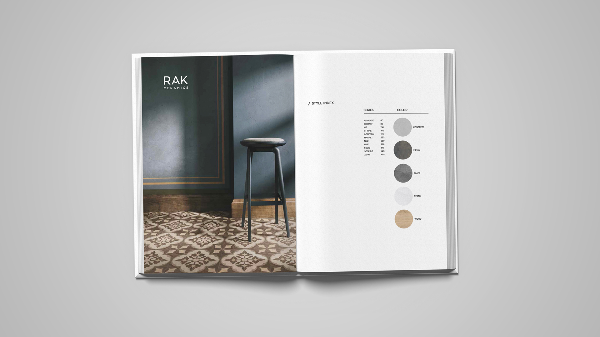
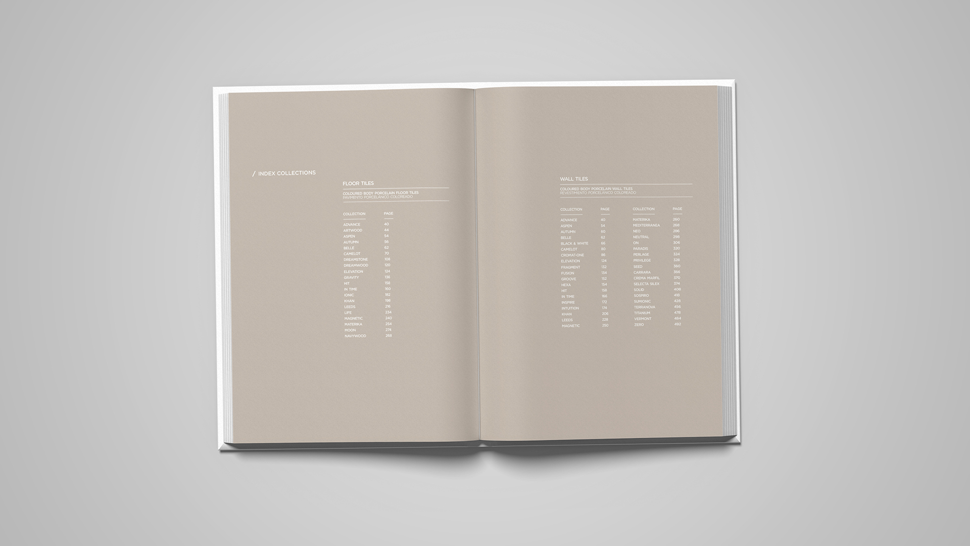
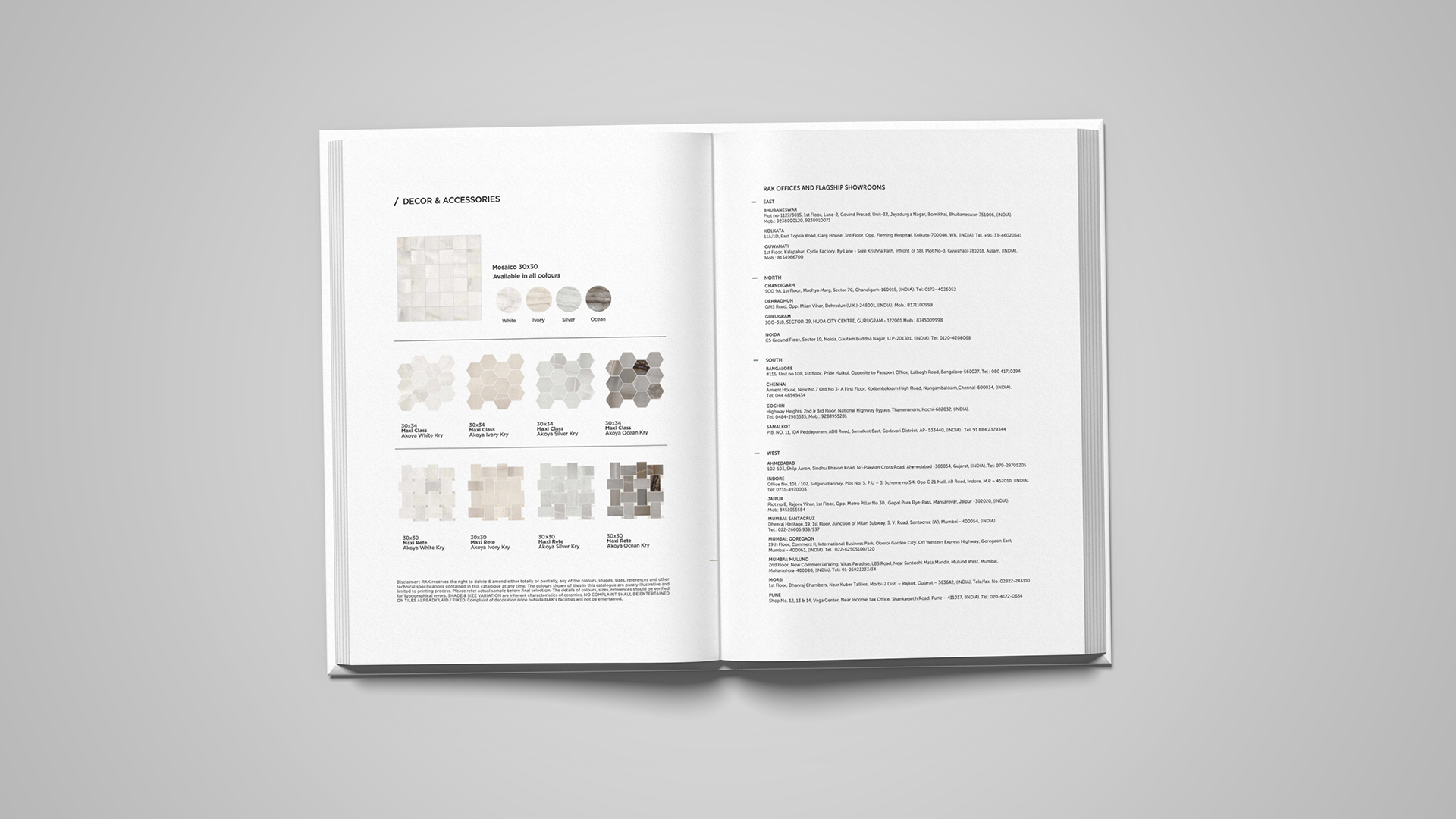
With a large number of products and collections to communicate, the challenge was to create a system that could handle extensive information without making the catalogue feel crowded or overwhelming.
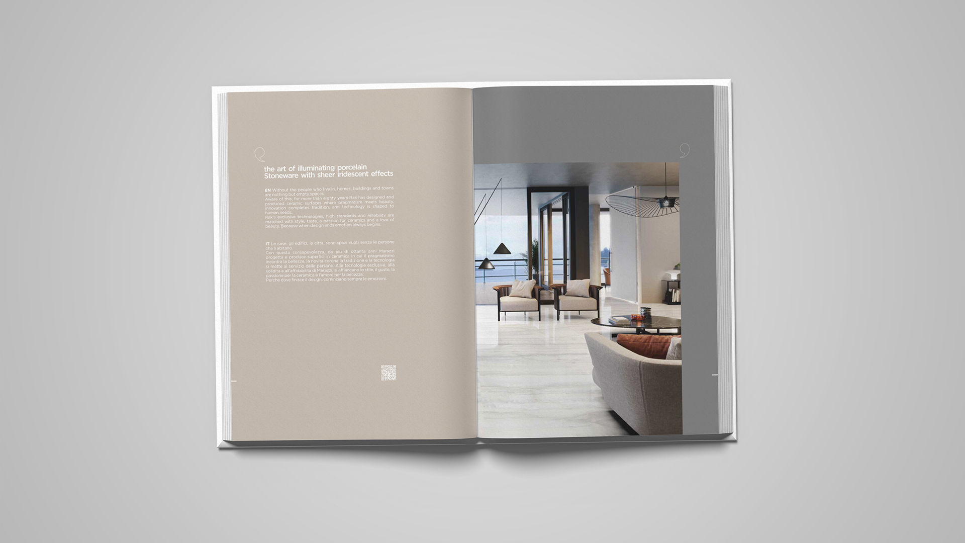
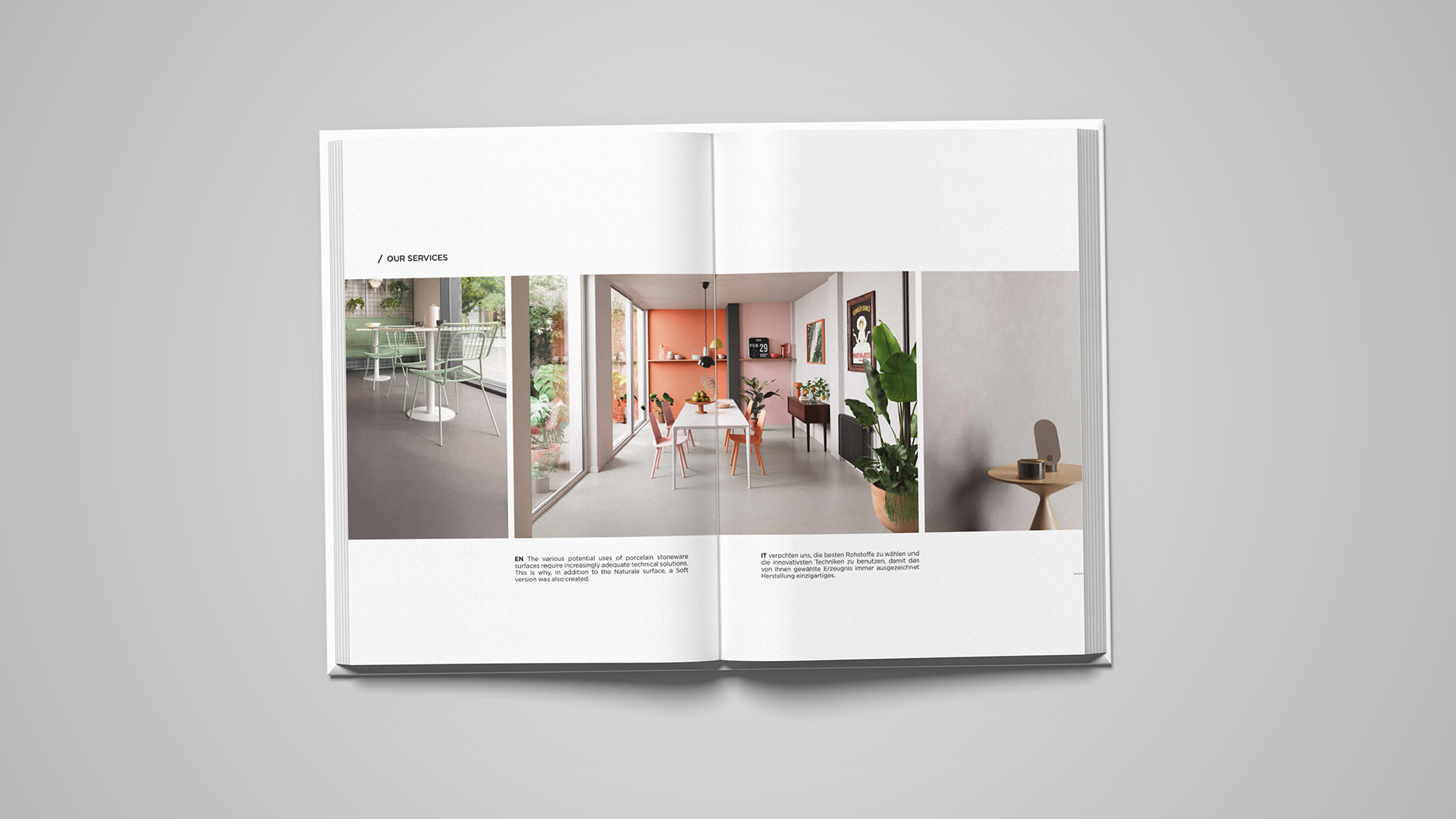
The design needed to balance product imagery, specifications, technical information, and collection details while maintaining a consistent premium appearance across every section.
RESEARCH
I studied international ceramic and architectural-material catalogues, luxury editorial design, contemporary product presentation, and global interior-design publications. I explored grid systems, typography, whitespace, image hierarchy, product categorisation, and information structure.
The research helped establish a clean visual framework where strong imagery and controlled layouts could communicate the scale of the RAK Ceramics portfolio without unnecessary visual elements.
CONCEPT
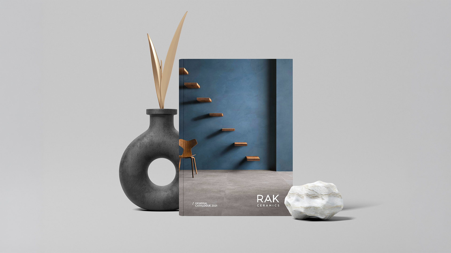
I contributed to the creative and visual direction of the catalogue, focusing on creating a consistent international-facing presentation. My work included layout development, art direction, typography, visual hierarchy, product presentation, image selection, page composition, and overall design consistency.
The final approach used simplicity as the visual language, allowing the products, materials, textures, and collections to communicate their own premium character.