CHALLENGE
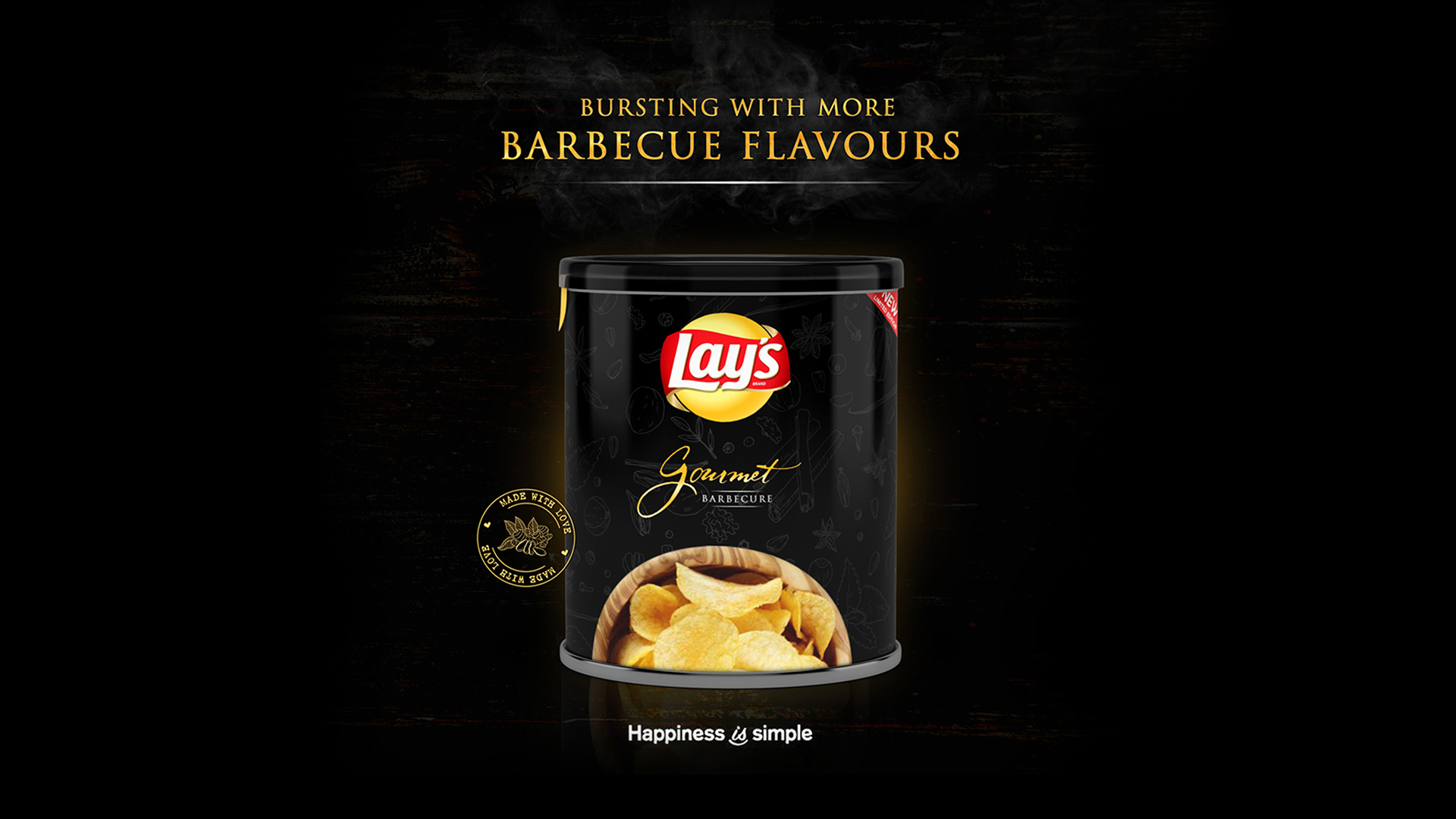
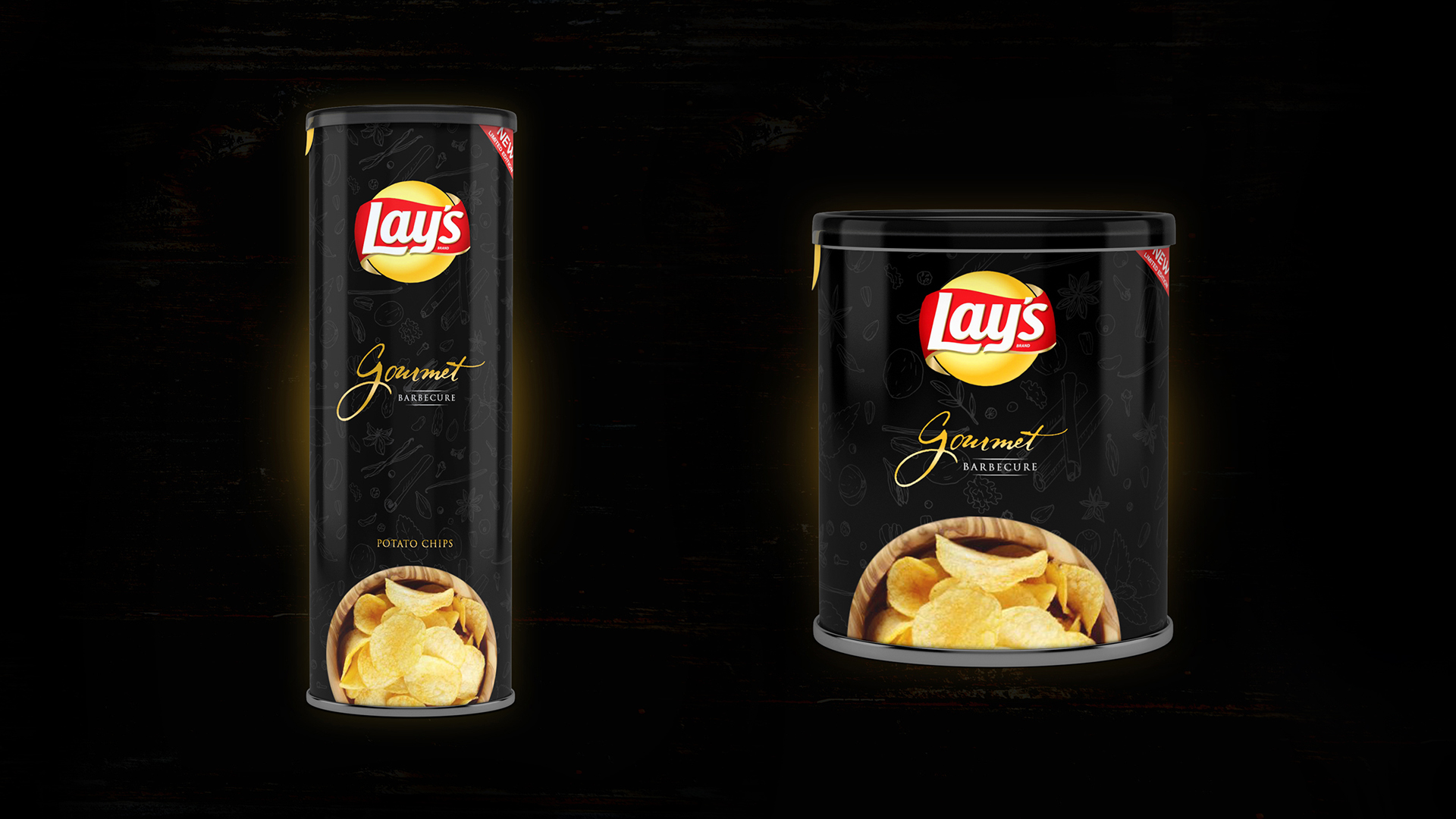
The challenge was to reinterpret a familiar snack product through a premium design perspective while maintaining its recognisable character. The packaging needed to communicate the rich Barbecue flavour while creating a sophisticated and distinctive visual identity.
I explored how colour, material, typography, and packaging form could work together to make the product feel more exclusive and contemporary.
RESEARCH
I researched premium food and snack packaging, luxury product presentation, barbecue flavour communication, typography, dark colour palettes, and alternative packaging materials. I also explored how premium brands use minimal layouts and tactile packaging to create stronger product perception.
This research led to the black tin-inspired direction, combining a bold appearance with a more refined and premium presentation.
CONCEPT
This was a completely self-initiated project, developed independently from concept to final visual execution. My role included product positioning, creative concept, brand direction, flavour presentation, packaging design, typography, visual composition, and final artwork.
The project allowed me to experiment with brand transformation, packaging innovation, and premium product positioning while challenging the conventional visual language of a mainstream snack product.